Day Dreams was printed with metal moveable type; non-metal type was in use but for large letters rather than for books. In the 1850s, the decade before the book was printed, T. Constable had founts of seven languages, including the English and Greek founts used here. A fount was a complete collection of type: all the letters, all the punctuation, all the italics, right down to the spaces to go between words. This was a large firm – in 1961 it employed more compositors than any other printer in Edinburgh, at a time when the printing industry was the third largest industry in Edinburgh.

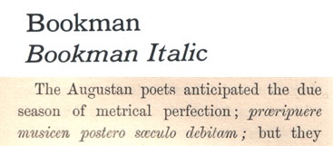
Samples of the typefaces.

|
The Day Dreams typeface was a recent style at the time of printing. In the samples here you can see there is a strong contrast between thick and thin strokes in the letters (the capital V is a good example) and flat serifs, making this a Modern font. This contrast wasn’t possible until the Industrial Revolution improved printing presses, metallurgy, and paper quality, producing a hairline stroke that didn't break the type or smudge the page.
|
By looking at letters like R, G, g, e, and Q, the typeface can be narrowed down. It’s important to study all the letters, numbers, and punctuation marks if possible, however: I thought this font was related to Modern Wide until I realised the question mark was didn't match and the ascenders were too tall. The font is more closely allied to CG DeVinne.
|
A fount includes not only roman letters, but also italics. There are two kinds of italics: true and oblique. In the Bookman sample (top right) all the same features of the roman type, all the same shapes, are duplicated in the italics. This is an oblique italic – basically, it’s just been shoved sideways. The italic in Day Dreams (bottom right) is a true italic: it has been specially designed as an italic, not just a supplement to the roman, and instead of having the same straight roman serifs it has a cursive serif.
|
|
|
|
The type in this book was composed by hand – Linotype machines wouldn’t come until the 1880s. Hand composing was done by compositors, who, reading the type both mirrored and upside down, put together every single individual letter, punctuation mark, and space on every page. This video gives a demonstration of the skills needed to put together a page of type.
|
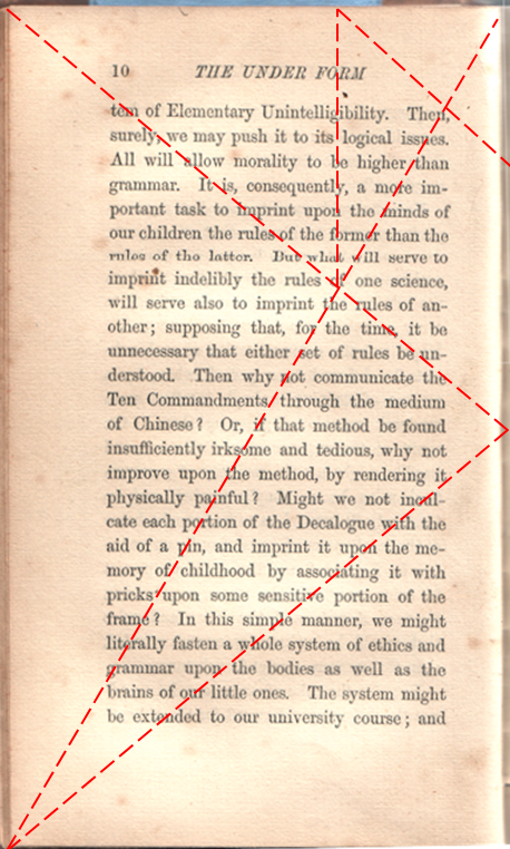
The classic page layout.
|
The very nature of how the text is arranged on the page gives us clues to the intentions of the printer and author. This layout is known as classic: it is designed for extended, linear reading, with wider margins on the outside and the bottom so there is room to hold it without obscuring the text. This, combined with the size of the book, tells us this a book to sit down and savour. It isn’t a textbook, it isn’t a reference book, it's a book to be read cover to cover in comfort.
|
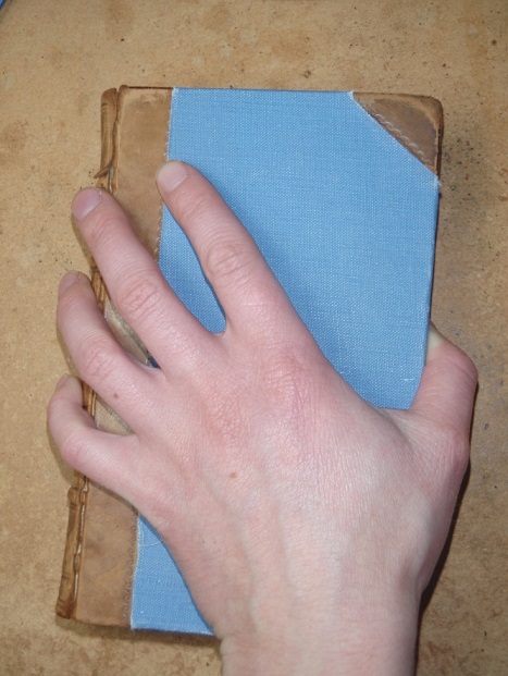
A book just the right size to relax with, not too big to hold.
|
For more information see:
http://en.wikipedia.org/wiki/Movable_type
An overview of moveable type.
http://www.youtube.com/watch?v=WgHst9Amhio
The making of metal types.
I Love Typography. http://ilovetypography.com/
A blog of all things type, with great resources about origins, history, and classification.
http://www.youtube.com/watch?v=wOgIkxAfJsk
This video is a great history of typography.
Southward, John (1882). Practical Printing. A handbook of the art of typography. “Printers’ Register” Office: London.
A fascinating book, written by a working printer of the 1880s to provide information to novices beginning in the field of printing who required practical information about the tasks at hand. A great look at how printing really happened in the 1870s and early 1880s.
https://blogs.commons.georgetown.edu/engl-090-fall2012/2012/11/08/for-use-with-our-quiz
A good diagram of type terminology.
Identifont. http://www.identifont.com/
A great resource for the layman to identify typefaces (note that it's better with modern typefaces than older ones).
http://theworldsgreatestbook.com/book-design-part-1/
http://retinart.net/graphic-design/secret-law-of-page-harmony/
The basic principles of page design.
